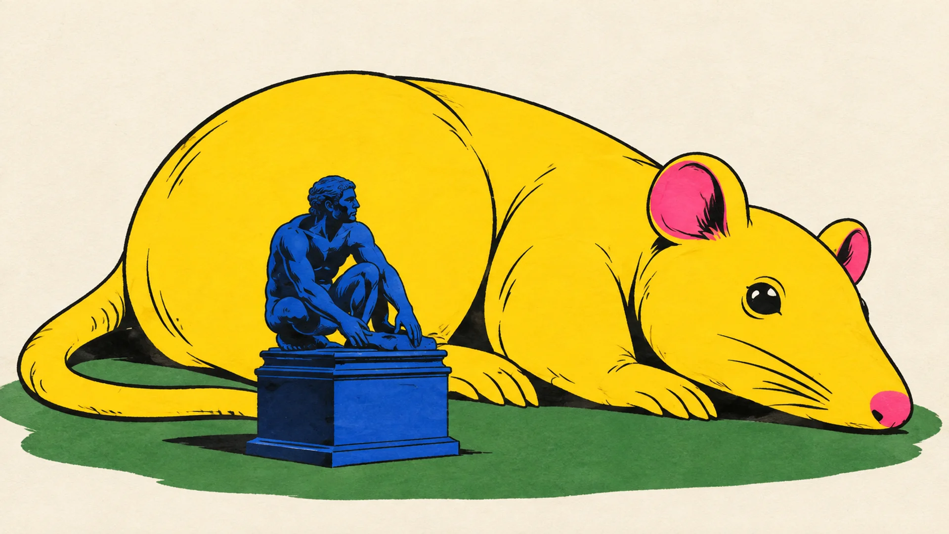
The golden rat has no intention of apologizing. It lies beside a small bronze figure, takes up an absurd amount of space, and makes established art look like something someone forgot to put back in place. I’m already on the rat’s side. It’s a relief to see an exhibition whose ambition is visible before anyone has explained it with a word ending in “-practice.”
One star
Two stars
Three stars
Four stars
Five stars
Disclaimer: Apropos Magazine received access or a review copy. As always, we share our own impressions — unfiltered.
Six stars
In Esben Weile Kjær’s THIRST TRAP, the proportions have run away with the pests. The rats are gold, the carnivorous plants have silver mouths, and the ticks are dressed in patterns that refuse to agree with one another. The works take over Ørstedsparken during Golden Days. There is plenty to look at here. Luckily, there is also something to linger in.
I read the exhibition as a trap for our own tolerance. The rat becomes easier to like once it has been given the scale of a monument and the prestige of gold. But if it has to be upgraded so dramatically in order to be welcome, how tolerant were we to begin with? That suspicion is what makes the inflated animals worth taking seriously. Enthusiasm comes with a bill.
The pest has earned the right to gold
A rat in the grass is usually a reason to call someone. A golden giant rat is a reason to reach for your phone. It is almost embarrassing to catch oneself making that shift. Apparently disgust can be rearranged if the packaging is convincing enough.
In the exhibition images, the seated rat is both enormous and oddly content. Its small front paws hang in front of its body; its tail draws a broad arc across the grass. There is something self-satisfied about it, which I rather like. It is not trying to prove it is useful. It has simply taken up space.
Next to the bronze figure, the gold becomes a joke about monuments. Bronze has weight and patina. The inflatable surface has seams and air. And yet it is the rat that wins the battle for attention. The old figure keeps its pedestal, but has lost control of the company it keeps.
The gold lends an authority the animal does not already possess. It says precious and worth preserving, while the motif says get rid of it. When those two messages sit on the same body, they reveal how quickly our judgment can be shifted by a surface. The rat has not improved its behavior or applied for membership. It has changed its dress code.
At the same time, the air-filled body makes the power of the monument temporary. The visible seams contradict the idea of anything eternal, even as the figure dominates the small statue. That gives me a more precise reason to be excited than size alone: the work shows that whoever takes up the most room today does not necessarily have a natural right to it. That also goes for the old figure on its pedestal.
In a 2025 Vogue interview, Weile Kjær describes his interest in making the boundary between beautiful and ugly unstable. The interview is about his practice and another work, Shell, not THIRST TRAP. Still, it offers a useful key: here, my taste is something the work can move around, rather than a fixed standard I can hold it up against.
The park was never innocent
Ørstedsparken is an exact place for this conflict to unfold. Its green spaces have also been meeting places for men seeking other men. Copenhagen Museum tells the story of the park’s place in the city’s queer history, with encounters going back to the 19th century.
That history changes the way the idyll looks. A thicket can be beautiful from the path and provide cover from another angle. When some people want a better view, others may lose the chance to be left in peace. The same landscape can offer very different freedoms to different people.
Golden Days itself connects the works to the park’s cruising history and describes how pruning has limited hidden spaces. I think the exhibition becomes stronger when that concrete connection is kept in view. Then the big animals are about more than a pleasantly loose invitation to accept difference. They stand in a space where visibility and discretion actually matter.
At the same time, it takes a little care to talk about people through pests. Queer life is, of course, not something that should be explained with a tick. For me, the connection lies in the power that marks something as unwanted: who gets to decide what belongs? You do not have to take over the label in order to examine who uses it.
The location therefore does more than give the animals a handsome backdrop. On a neutral fairground, the golden rat would still be funny. In a park with this history, its enormous visibility becomes a provocation against a space where others have needed to be able to hide. That is the difference between a site-specific work and a large object that merely happens to be outdoors.
But visibility is not automatically liberation. If everyone must be seen, the possibility of choosing one’s own audience disappears. I think the exhibition is most interesting precisely in that contradiction: the animals demand your full gaze, while the park’s history is also about escaping it. The right to take up space and the right to discretion cannot replace one another. A free park must be able to hold both.
The tick is better dressed than its apology
The ticks wear zebra stripes, checks, leopard spots, and colors that bleed into one another. Their round bodies and stubby legs make them almost cute. I find myself more eager to study the patterns than to keep my distance. It is a remarkably effective surface to give an animal whose company I would otherwise refuse on the spot.

The patterns turn the animal’s body into something you can read as style. The tick does not arrive in discreet, nature-colored camouflage, but in checks and zebra stripes competing for the eye. My reading is that the decoration breaks the link between what is natural and what is appropriate. The unwanted does not have to look modest in order to ask for space. It can also show up overdressed and leave us to deal with the problem.
The plant mouths, by contrast, turn up the teeth. Their silver surfaces offer shine, while their open mouths offer to eat. In doing so, the direction of the gaze is reversed: I can look at the plant as an object, but the form also places me on the wrong side of a mouth. The viewer is not quite as sovereign as she had assumed. It is a rather effective move when the subject is desire and control.
Golden Days explains the title THIRST TRAP through attraction and control over being seen. I would push that reading one step further: when a pest can seduce my gaze, my own disgust becomes less credible as a reason to keep it out. It suddenly seems susceptible to influence. I have to ask whether I have a reason or just a taste judgment that has been allowed to rule for too long.

Happy to have an image. Also happy to have a thought
The obvious objection, of course, is that golden animals and psychedelic ticks can end up as the backdrop for a pretty post. Something big and photogenic is not automatically a good artistic idea. You can easily tempt people to look without giving them anything to see.
That counter-reading cannot be brushed aside. If I only take the image home with me, the city has gained a decorative rat, and no one needs to change their mind about the people who are actually kept out. What was despised has become acceptable on the condition that it delivers a good motif. Then the exhibition risks repeating exactly the trade I read as its problem. A photogenic pest is, after all, not social change.
Still, I lean toward the more demanding reading, because the contradictions are built into the works. The golden body is still a rat. The plant keeps its mouth. And the encounter with the park’s sculptures lets the inflatable guest steal attention from something that seemed to have permanent residence rights. The discomfort has not been fully decorated away. It can still disturb the enthusiasm.
That is why THIRST TRAP impresses me as an idea. It uses the desire to look as an entry point into examining the one who looks. I do not need to have completed a basic course to be lured in by gold. But I also cannot keep calling my first reaction common sense when it was so easily bought by a shiny surface.
For me, the exhibition does not end with the idea that everyone should simply be allowed to be different. It leaves a more difficult question behind: do we make room for what disturbs us, or only for what is attractive enough to be forgiven? The rat has received its gold-plated entry ticket. I want to know what we do with those who do not have one.
THIRST TRAP can be experienced in Ørstedsparken until 12 September 2026.
En stjerne
To stjerner
Tre stjerner
Fire stjerner
Fem stjerner
Seks stjerner